UX Design Challenges and Solutions through Customer Understanding
I joined XL8 in June 2023 as a Product Designer after seven years of experience designing UI/UX.
I am delighted to have the opportunity to share the challenges and solutions I faced in designing services for XL8 in the past six months through this blog. I hope that my insights will prove valuable to many readers.
CAT is not a cat
In the early days of my career at XL8, I felt quite confused. The team meetings were filled with terms and jargon I had never encountered before. Until I submitted my resume, the term CAT conjured up images of domestic felines, revealing my limited knowledge in this field. Moreover, subtitles were merely perceived as unobtrusive text flowing through movies.
Joining a company focused on providing services related to creating subtitles, translating, and localizing content felt like landing on an unfamiliar planet. Navigating through meetings proved to be a challenging endeavor, and my initial action in this bewildering situation was to meticulously organize and commit unfamiliar terms to memory.
As the onboarding period unfolded over the course of about a week, CAT transitioned from being a cute household pet to embodying the concept of 'Computer-Assisted Translation' in my professional lexicon.
UX Design Based on Experience
During the onboarding period, I focused on improving the customer experience, gradually elevating my understanding of the product. However, challenges persisted, primarily in areas where I had to rely on 'assumptions' due to not being an actual user. Creating an excellent product necessitates a profound understanding of the customer’s requirements. To enhance this understanding, experiencing the product as an actual customer is the most effective approach. Nevertheless, in a B2B environment, becoming an actual user is challenging, making it difficult to precisely comprehend the aspects customers truly need.
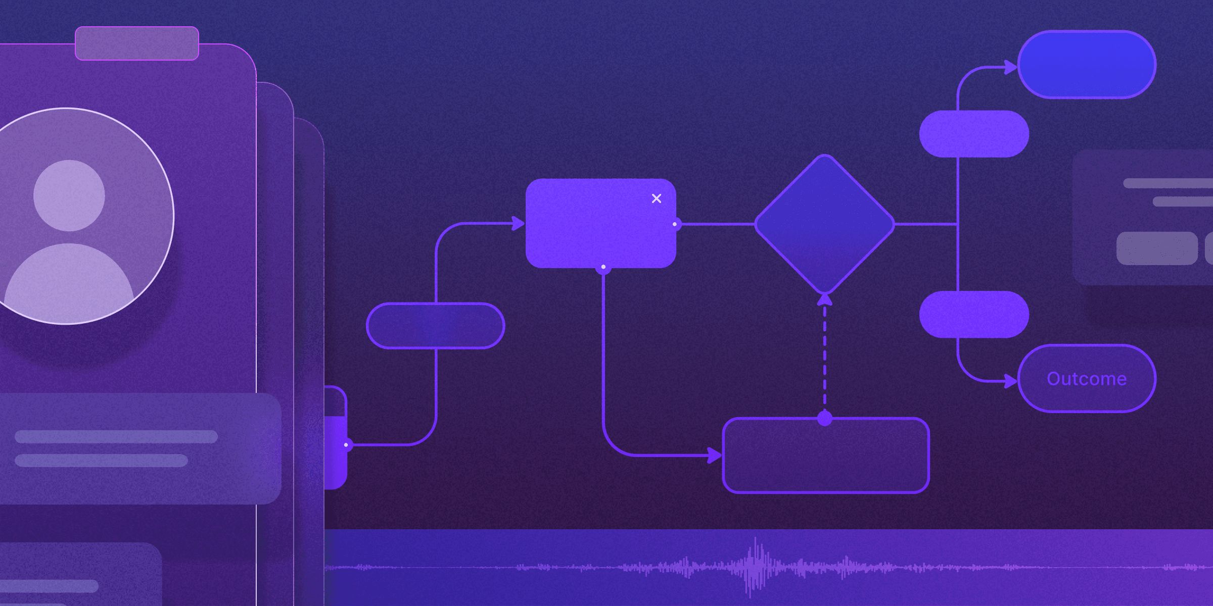
In my most recent project focused on enhancing the Bottom Canvas area of the ‘XL8 Subtitle editor’, I encountered the need to understand specific customer requirements again. Through this project, I had to delve into the difficulties customers faced and elaborate on how these challenges could be effectively addressed.
Redesign the Bottom Canvas of the XL8 Subtitle Editor
One of the most important users of our subtitle editor are the 'Post-Editors' who go through the translated subtitle content and edit unnatural sentences. For them, it is crucial to see as many subtitles as possible at a glance in order to reduce total work time.
We determined that our subtitle editor needed more space for the segments themselves. To give more room, we decided to first redesign the bottom canvas. The solution was simple, but the elements were intricately connected.
Additionally, considerations for future functionalities and a clear understanding of the UX from the customer's perspective were essential. Throughout this project, two key points became my focus:
- Reducing the height of the Canvas and efficiently rearranging elements
- Expressing the status of Audio track and Segment UI
Reducing the height of the Canvas and efficiently rearranging elements
To tackle this challenge, a thorough understanding of the user was imperative. It was crucial to comprehend how Track and Segment UI are utilized, how timecodes are interpreted, and the purpose of the waveform. Without this knowledge, even the most refined UI improvements could compromise the overall UX direction. Therefore, acquiring expertise in this area was essential. Initiating the improvement process with limited subtitle editor knowledge made it challenging to determine which elements needed adjustment. Seeking guidance from a knowledgeable PM and gathering diverse references from similar services led to a better understanding of issues with our editor. This process involved not just reducing the overall height but also sketching out a rough plan for effectively arranging the elements.
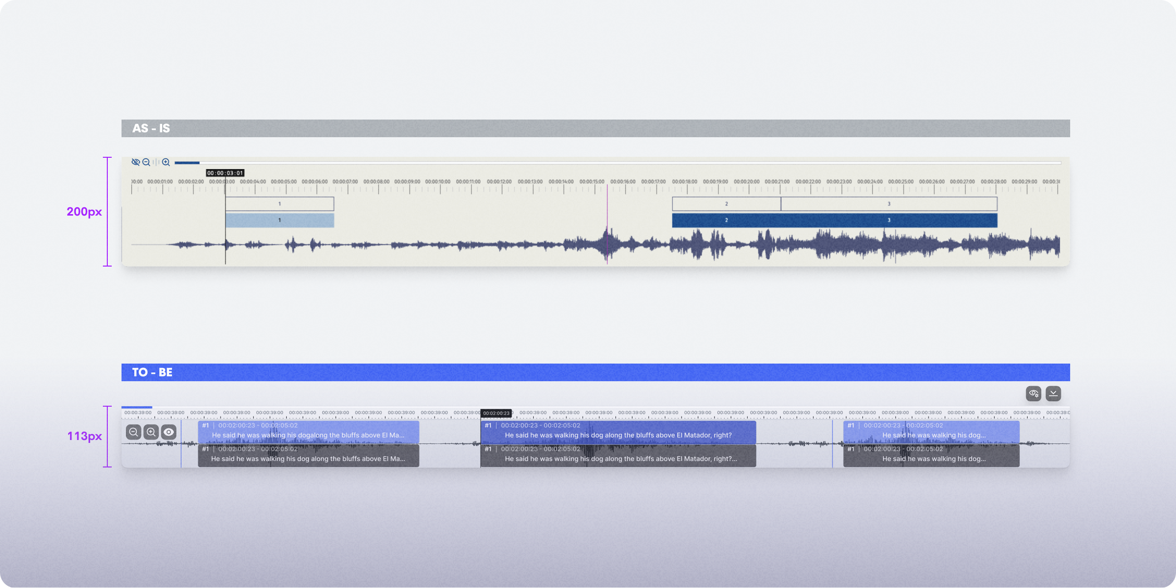
XL8 Subtitle Editor Bottom Canvas Redesign - Considerations for Efficient Rearrangement
Several considerations were taken into account as I planned the arrangement of the editor's bottom canvas. The audio track and Waveform each have their own areas, resulting in wasted space.The necessity or accessibility of the various controls were not clear.
Based on these considerations, reducing the height of the canvas was achieved by placing Track and Waveform at the same height and minimizing the horizontal scroll area. Removing the unclear buttons and aligning similar elements allowed for efficient arrangement. The View Option button, controlling the Canvas, was positioned outside with an icon change for intuitive inference of the action. In conclusion, to reconstruct the screen effectively, a deep understanding of both the screen and the customer is essential, allowing for the prioritization of screen components based on this understanding.
Representation of Status in Track and Segment UI
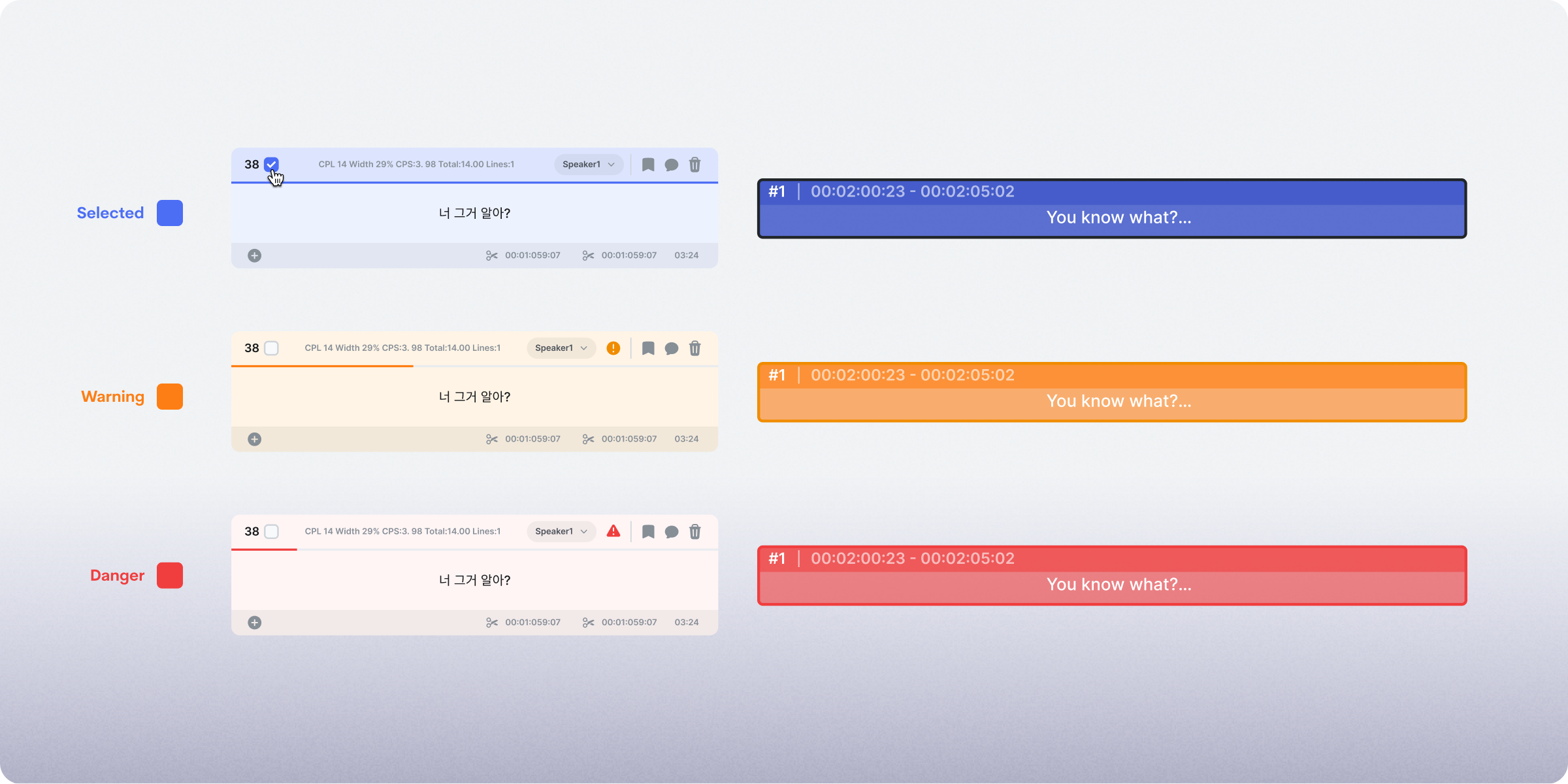
Track and Segment UI should display the same status. In other words, when a Segment is selected, the Track should also enter the selected state, and vice versa. One might question why elements with similar characteristics need to be duplicated on the screen. In essence, Segment UI serves the purpose of editing, while Track aims to set the timecode for the Segment. Hence, they need to be closely intertwined.
Both Segment and Track have four states: Focused, Selected, Error, and Warning. It is advisable to use the same color and icon for each state. Maintaining consistency in color and iconography allows users to easily recognize identical states. Therefore, I put considerable effort into representing each state with the same color. However, achieving the exact same color was not feasible, and I had to opt for similar hues. Using the identical color as the Segment caused poor differentiation from the background, especially when the Waveform was overlaid with subtitles, necessitating a subtle distinction.
Even in seemingly straightforward tasks like modifying a simple UI, it's not easy to make judgments about an appropriate UI, considering both aesthetics and usability. However, having a deeper understanding of the customer and familiarity with screen composition can lead to better decision-making in such situations.
Ultimately, Customer Understanding Shapes Excellent UX
No matter how impressive a feature may be, if it fails to effectively communicate its value to customers, the feature falls short. While I've always been aware of this, my time at XL8 over the past six months showed its importance. In specialized fields like CAT tools for language translation, which were new to me, the challenges have been daunting. The recent project I undertook, particularly in subtitle editing, emphasized that understanding the customer is crucial for accurately assessing the significance within the interface, making even minor improvements a careful and intricate task.
The key message of this post is that the most critical aspect of UX is a deep understanding of the customer. Especially when designing tools for specific professionals, such as CAT tools, a profound understanding of the customer can be a powerful asset in crafting effective and meaningful interfaces.
Contributors
Cherry Oh
Product Designer